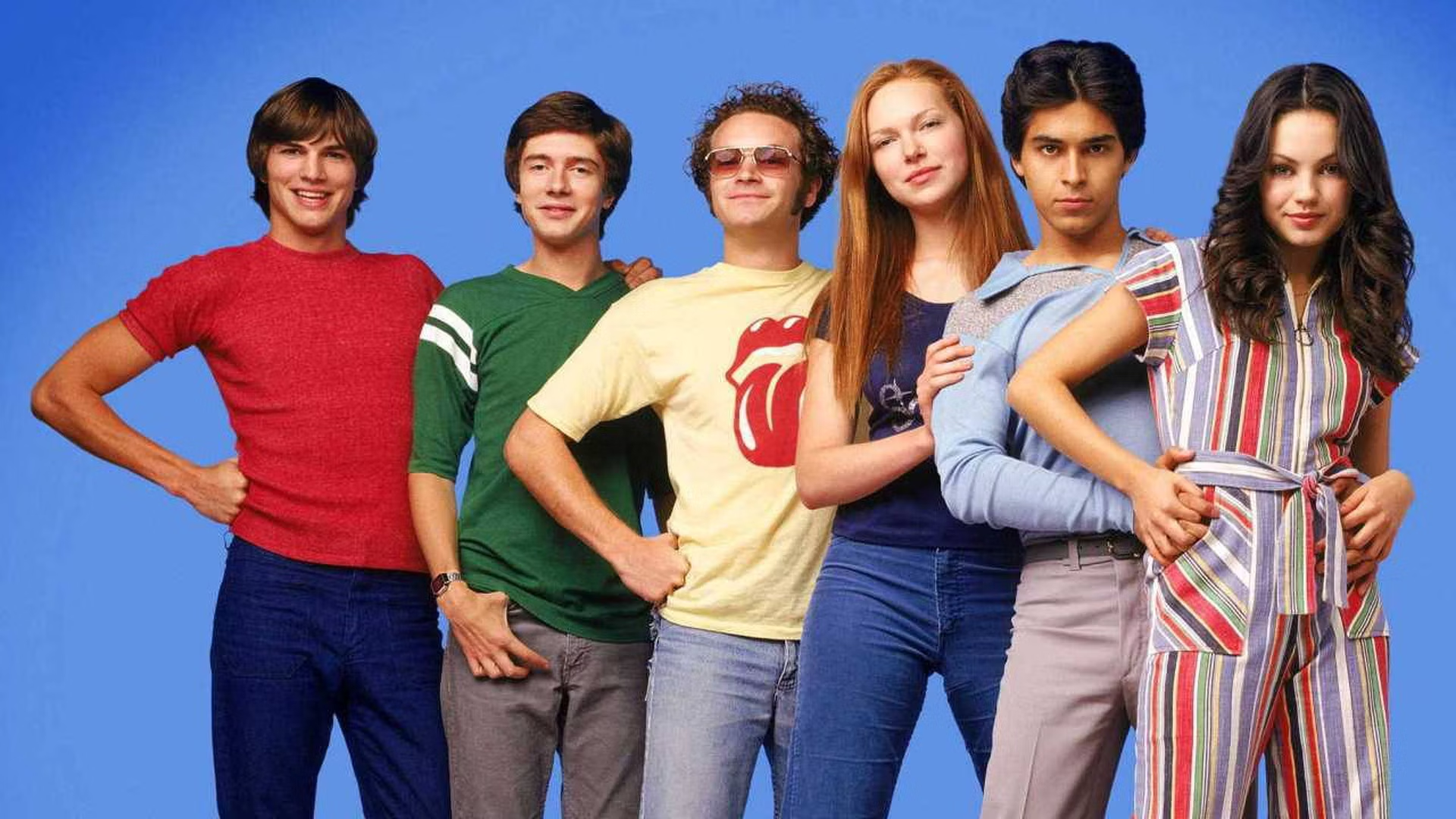
In the world of television, few shows capture the essence of a particular era quite like “That ’70’s Show.” Set in the fictional town of Point Place, Wisconsin, during the late 1970s, the series follows the lives of a group of teenagers as they navigate the challenges and adventures of adolescence against the backdrop of the disco era, bell-bottoms, and lava lamps.

Beyond its witty humor and memorable characters, one aspect of the show that often goes underappreciated is its distinctive typography. From its opening credits to promotional materials, “That ’70s Show” embraced a unique typographic style that perfectly encapsulated the spirit of the era. Let’s take a trip down memory lane and explore the typography that defined this beloved sitcom.

The Opening Credits: Groovy Fonts in Motion
Every episode of “That ’70s Show” begins with an iconic opening sequence, complete with vibrant colors, kaleidoscopic visuals, and, of course, funky typography. The show’s title appears on screen in a bold, retro font that immediately transports viewers back to the disco era. The letters are often accompanied by psychedelic effects, such as swirling patterns and flashing lights, adding to the overall sense of nostalgia and fun.
One of the most striking elements of the opening credits is the use of dynamic typography. As the camera moves through various scenes of the characters hanging out in Eric Forman’s basement, the letters of the title morph and shift in sync with the music, creating a sense of rhythm and movement. This playful approach to typography sets the tone for the show and establishes its unique visual identity from the very beginning.
Capturing the Essence of the ’70s
In addition to its opening credits, “That ’70s Show” featured typography prominently in its promotional materials, including posters, advertisements, and DVD covers. The designers drew inspiration from the distinctive lettering styles of the 1970s, incorporating elements such as bold, sans-serif fonts, vibrant colors, and geometric shapes. One of the most memorable examples of the show’s typography can be seen in its logo, which features the words “That ’70s Show” arranged in a stacked format with each letter surrounded by a colorful outline. This design not only evokes the aesthetic of the era but also captures the lighthearted and playful spirit of the show itself.
Though “That ’70s Show” ended its run in 2006, its impact on popular culture continues to be felt today, including in the realm of typography. The show’s distinctive style has inspired countless designers and artists, who continue to draw inspiration from its bold colors, retro fonts, and psychedelic motifs. Moreover, the resurgence of ’70s fashion and design trends in recent years has only served to further cement the show’s legacy as a cultural touchstone. Whether it’s through nostalgic rewatching or discovering the series for the first time, fans continue to be drawn to “That ’70s Show” for its timeless humor, relatable characters, and, of course, its unforgettable typography.
Influence of That 70’s show
I grew up on this show and seeing this iconic font in the beginning of each episode is so nostalgic for me now since I’m learning about “That ’70s Show” font. “That 70’s Show” understood this implicitly, embracing a bold and vibrant typographic style that perfectly captured the essence of the disco era. From its dynamic opening credits to its promotional materials, the show’s typography remains an integral part of its enduring appeal. As we look back on this beloved sitcom, it’s clear that its typography is more than just a visual flourish—it’s a key ingredient in what makes “That ’70s Show” so iconic and unforgettable. So the next time you find yourself watching an episode, take a moment to appreciate the groovy fonts and far-out typography that helped define a generation.


