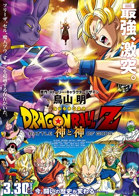
In today’s animation industry, a lot of poster production is related to typography. Although the cartoon poster focuses on the illustration screen. The power of words is also on display in posters. Follow the rules of typography to create, and perfectly combine the picture and text in a small poster. This article will explore the gap between cartoon posters and ordinary poster design. And what kind of valuable information is hidden in it to convey to the audience?
Introduction of the Anime Posters
Anime posters are based on color, lines, and characters. In the case of magazine covers, for example, different characters appear in each episode of the anime, accompanied by elements from that episode. So, the color in the anime cover is the main way to attract attention. Because it can simply show the character of the character. Because people in early times did not have strong ideas about typographic design and inspiration. So, the whole is based on bright and three primary colors. In particular, the style presented by the covers of physical books and electronic books after printing will also change. Therefore, when considering printing, the color will be bright.

Copyright by puppetonachain
Anime Title of Font
The title “Dragon Ball Z” will be prominently displayed at the top of the poster in bold and stylized font. These letters may be slightly rounded or have sharp edges to convey a sense of strength and power. Because the early style of comics emphasized the sense of line, the use of black surfaces to highlight character details. Applied to text, typesetting has a tool called outline that can be adjusted to enhance the details around the text. Make the text more noticeable.

Copyright by IMDB
Background of texture
Typography can be overlaid on a textured background to add depth and visual interest to the poster. Textures such as cracked stones, energy waves or starry skies can complement the overall theme of the collection and enhance the impact of the typography. In the Dragon Ball Z comics, we often see a lot of planets and ground fight scenes. In addition, the author’s overall painting style is to highlight the texture details and figure lines. Therefore, many different patterns and texutres can be used in typography to change the font. Or enhance the visual effects of the pictutre to convey information.


The combination of Comic Book Elements
To enhance the dynamic feel of the poster, you can include action sound effects such as “KA-ME-HA-ME-HA” or “POW” in the layout, mimicking the style of comic book fonts. These sound effects will be written in bold capital letters and have exaggerated spacing and size to emphasize the impact of the depicted actions.

Copyright by Shinichi Fukumitsu
Overall, the typography in the ’90s Dragon Ball Z posters was designed to convey the excitement, action, and energy of the series, using bold fonts, dynamic layouts, and bright colors to capture the attention of fans and viewers. Audiences and fans want to see the characters come out and be surprised. The scheduling design can leave a lot of suspense and mystery in it. Do not reveal the overall feeling of the plot comic on the premise of creation.


